Mother
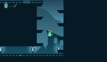
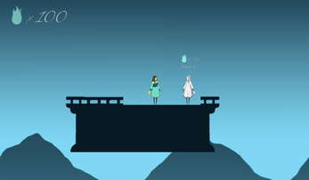
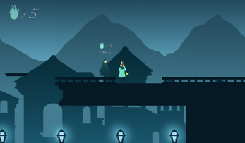
In this game you play as a new mother trying to learn how to live a better life. Through her journey she will learn that a lot of things she knew about being a mom are, in fact, misconceptions and as she gets rid of them she will be able to do things that she thought were impossible.
Your only enemy is gravity itself and the burden you carry. So as you advance and leave the burden behind, you will manage to go higher and further.
Some segments of this game are really hard and can be frustrating, but as you leave the unnecessary burdens behind things will start to become more pleasant.
This is my first published game. It was initially made for the Jam9 game-jam with the theme "Mother", but due to technical problems I couldn't submit it in time. Weeks later I took the project again to finish it. I reworked the level design and gave it some language options. As my mother's birthday approaches, I now publish this game as loving gift for her.
Updates v0.0.1.3 (25/06/2021):
- Rebalancing of the jump and walking speed
- Some tiles are now one-way collision. Some parts of the game are now less frustrating
- Breakable platforms now shake when you step on them, giving a sign of different behavior
In the near future I might implement some new features to the game, such as:
- Checkpoints
- Spanish translation
- Pause Menu
That's it, enjoy the game!
| Status | Prototype |
| Platforms | HTML5 |
| Release date | Jun 04, 2021 |
| Rating | Rated 4.0 out of 5 stars (1 total ratings) |
| Author | Rigashii |
| Genre | Platformer |
| Made with | Godot |
| Tags | 2D, artgame, Casual, Female Protagonist, jumping, Non violent, One-shot, Short, Singleplayer |
| Average session | About a half-hour |
| Languages | English, Portuguese (Brazil) |
| Inputs | Keyboard |


Comments
Log in with itch.io to leave a comment.
I was looking for something for Mother's Day and I found this game that talks about how many women end up losing their identity in the role of mother, often pushed by the expectations of their family and friends.
But with the message that it is not necessary to forget who you are and try to reconcile being one with the new role you have. I thought it was a good message and something quite tender although I don't think I could say much more, the mechanics of how each new resolution of the being reduces the weight he feels on his person, which is reflected in how gravity is reduced and it is possible to reach to new places.
Very good concept for a small project, but with a lot of feeling.
Thank you so much for playing the game and posting a video about it! So glad you enjoyed the concept and the message. It was made with a lot of care!
Your comment actually motivated me to get back to my game design studies!
Much love!
Good work my friend. Here are some things I could think of while playing for a bit.
The Good:
Jump upgrades were really well connected with the theme of the game.
The "Back and Forward" design to progress is good. The experience can feel like a chore sometimes due to other problems.
Good indication when there's a platform invisible to the player position. The use of the collectible was wise in this regard.
Platforms are easy to land (corners).
The parallax effect is well implemented.
Minimalistic visuals are pleasing and music is comforting.
I think the writing is good, although it could be improved at some points (played in Portuguese). But honestly, this is beyond me.
The Bad:
Platforming relies too much on perfect timing, an early section of the game is very offputting due to this behavior. Try being more forgiving and "cheating" for the player a bit, implementing a "Coyote Time" would help a lot. The video "Why Games Lie to You- The Fallacy of Fairness" by Youtuber Adam Millard - The Architect of Games has some good insights on this matter.
Auto-destructible platforms could have, at least, a minimum of visual indication. Make them tramble or slowly disappear after the player steps on them.
The part with multiples auto-destructible platforms is a bit unforgiving since you need to replay everything again, thus becoming offputting. This is not a problem with checkpoints implemented.
Collision boxes are too restrictive at corners. Make them easier to pass from below to upward. Landing should continue to be safe.
Additions:
Jumping sounds variation: just one gets really repetitive. The game music could have some variation as well.
Skip all-text button: when replaying (because of losing the game) it got a bit tiresome to see all the conversations.
I know this is a prototype, so take these ones with less urgency:
Adding more juice to the game would improve the overall experience. Search for the subject "Game Feel". The videos "Juice it or Lose it" and "The Art of Screenshake" are strong recommendations.
The use of different sprites to show character progression (not gameplay, but the thematic of letting burdens behind) can enhance the experience, I think.
Visualization of burdens can also strengthen the thematic.
Wow, thank you so much for all this feedback! It really helps a ton.
I'll check all your suggestions of videos e try the corrections you pointed.
You're welcome =D But congratulations on publishing your first game, this is very important to grow a better developer. And just to help a little more:
This is where I talk about the restrictive Collision boxes, try jumping from there to the platform while holding forward. It should work but it doesn't.
Lastly, this is the "offputting early section of the game" that I mentioned, it shows you how "timing perfect" the game is. But now that I think about it, the aspect of the previous image might contribute in this case as well, since the character is very close to the upper platform's corners.
for me the jumps required are too pixel perfect and its very difficult to judge how close you are to the edge because of the characters leg design and the way it slides with every key input...
I'll keep that in mind for a few corrections that I have in mind.
Thank you so much for the feedback
Updated! Thanks for the support!